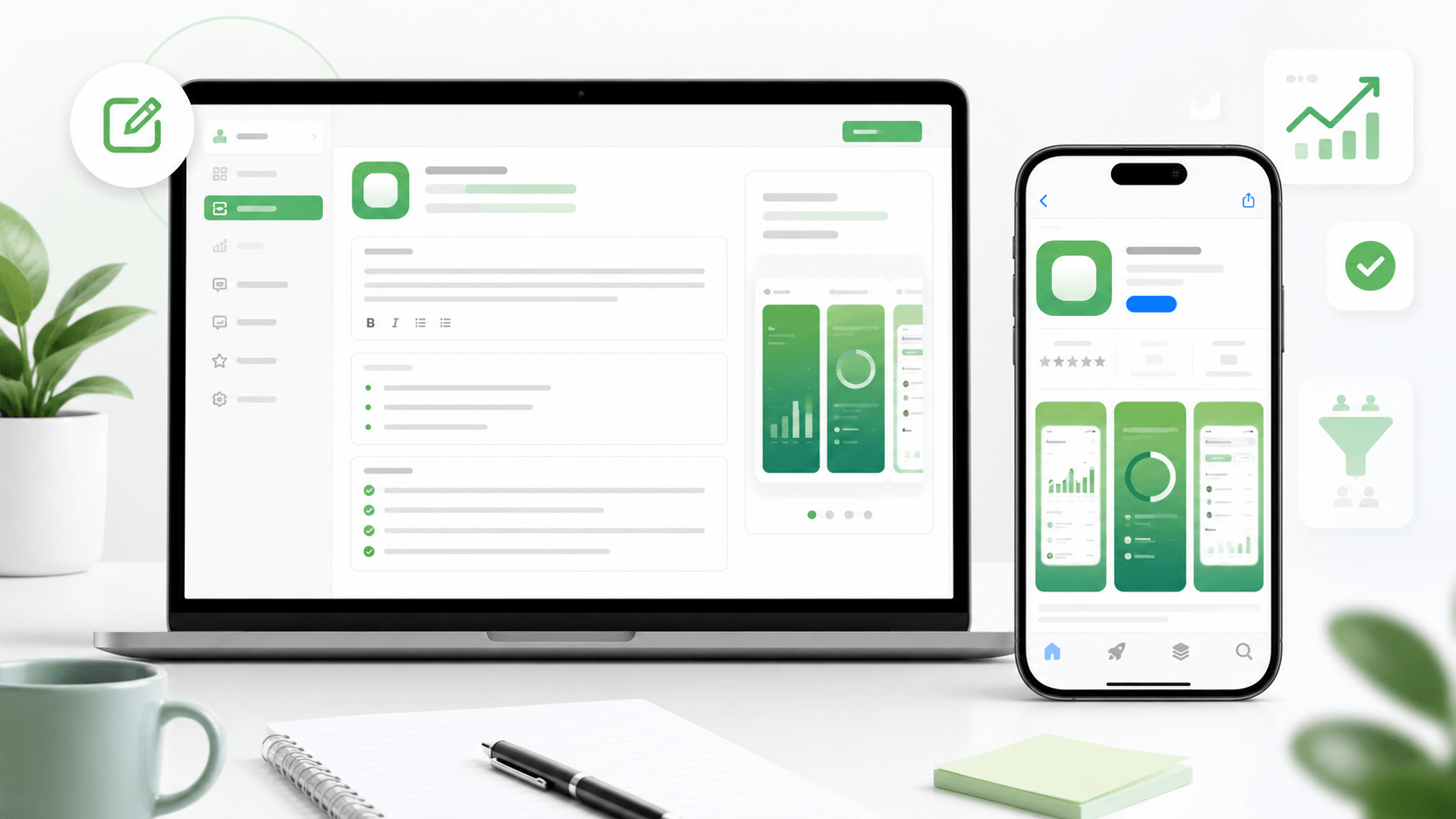
A better app description does not start with a feature list. It starts with the reason a real person would care. Users are not looking for your architecture, your roadmap, or every small capability. They are looking for a reason to install.
The opening lines are the most important part. On many store pages, users only see a short preview before they need to tap for more. Use that space to say who the app is for and what result it helps them get.
A weak opening says something like "A powerful productivity app with many useful features." A stronger opening says "Plan your day, track what matters, and finish small tasks without losing focus." The second version is still simple, but it describes a user outcome.
After the opening, group the rest of the description around benefits. If you mention a feature, connect it to why it matters. "Custom reminders" is okay. "Custom reminders so you remember the task before it becomes urgent" is better.
Keep the tone direct. New apps often make the mistake of sounding bigger than they are. Early users can feel that. It is better to make a narrow, believable promise than a huge generic one. A small app that solves one clear problem is easier to trust than an app that claims to do everything.
Use short paragraphs. Store visitors skim, especially on mobile. If the description looks like a wall of text, many users will skip it. Each paragraph should earn its place.
You can also use the description to remove doubts. If the app is free, say so clearly. If it works without an account, say that. If it is built for iPhone, Android, students, indie developers, parents, travelers, or another specific audience, make that obvious.
Before publishing, read the description out loud. If it sounds vague, inflated, or full of words nobody would say in real life, simplify it. The goal is not to sound impressive. The goal is to make the right user understand the value fast enough to install.