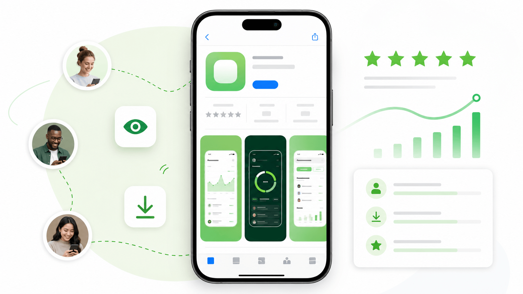
When somebody finds your app for the first time, they usually do not read everything. They scan. The icon, title, rating, first few words, and screenshots all work together, but screenshots often do the heaviest lifting because they show proof.
For a new app, proof matters more than polish for its own sake. A user is asking a simple question: is this app useful for me? Your screenshots should answer that question before the user has to think too hard.
Start with the first screenshot. It should show the main value of the app, not a generic welcome screen, empty dashboard, settings page, or abstract branding moment. If your app helps people track habits, show the tracking experience. If it helps them write better notes, show a note being improved. If it helps them find something faster, show the result.
Add short captions, but keep them specific. A caption like "Organize your day" is weaker than "Plan today in under one minute." The second version gives the user a concrete outcome. Screenshots should not be full of tiny text either. If the caption cannot be read on a phone store page, it is doing decorative work instead of selling the app.
The first three screenshots should tell a small story. Screenshot one explains the main promise. Screenshot two shows the core workflow. Screenshot three shows a result, benefit, or reason to trust the app. That sequence is usually stronger than showing three unrelated screens.
Avoid showing unfinished or empty states unless the empty state is genuinely the product. Early users are already taking a chance on you. A page with no data, no example content, or unclear labels makes the app feel abandoned even if the product is good.
Before you ask for reviews or early downloads, open your store listing on an actual phone. Look only at the first three screenshots for five seconds. If you cannot explain what the app does after that, improve the screenshots before sending more users to the page.
A simple rule: screenshots should reduce uncertainty. The user should leave the store page thinking, "I get it, and this looks useful enough to try."